Design the mundane
Last week we talked about the importance of design. That everything is worth being designed well.
Maybe it’s the creative heart (or brain, or…?) in me, but my heart definitely goes pitter-patter when I’m happily surprised with an ordinary object designed well, when tradition’s (and often, budget’s) sake would dictate mundane. I’ve been noticing it more frequently in the last year…and much more frequently in the last couple months. I’ve yet to form a theory on why this is now becoming a (positive) trend, or if I’m only just now noticing it, but I figured while these thoughts are mulling in my head, I would share the work of those who have chosen to design the everyday objects that are typically boring and created without thought.
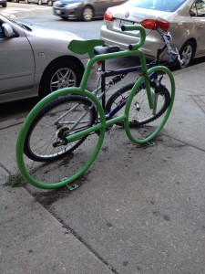
A couple different trips have taken me to Chicago in the last month or two. On the last two trips, in different parts of the city, I happened across some bike racks. Typically this means a bent pipe, substantial enough in size to keep a locked bike where you left it. Or at least try.
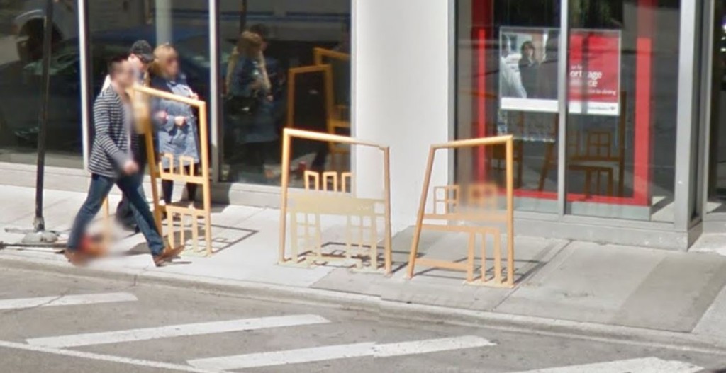
On these two trips, in two different areas of Chicago, I happily happened upon some well-designed bike racks. The seemingly boring was given some thought as to visual aesthetic as well as function.
How cool are these? The second one, especially. I actually had to pull that one from Google Street View because I was in an uber and couldn’t get my phone out of my pocket in time. These artists took some time to think about the function AND the design aesthetic. Hat tip.
What about you? Have you seen any everyday objects with thoughtful design lately? I hope to make this a running series as I continue across things which have been designed well. I would love your input, as well. If you come across something: tweet me, tag me on instagram, or email me.


