Architectural Standards: What’s in a page layout??
How do you layout a page for an architectural set? This idea, in previous years, was not something I gave much thought to. I (evidently) had been lucky enough to intern at some places with both high/quality standards and templates set up and maintained for project files and sheets.
In previous jobs (working for contractors, at the state, etc) however, I’ve realized that a quality set of standards for a CD set are….not common. Some of the sets I’ve seen have been enough to cause an immediate onset headache.
Today, we’ll focus on page layout. More specifically, how do you number and lay out your views on the sheet.
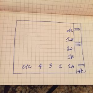
This was the format I was taught (at multiple firms):
Columns and rows. I was taught the eye moves from the lower right up to the upper left. And to not put any important details to the left edge because they will get lost in the roll of the set in the field.
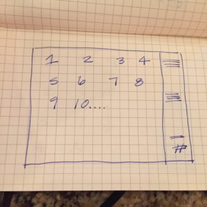
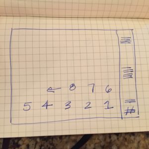
THIS, however, is a recreation of all of the bad that I’ve seen in the last…while.
Which makes me go…
So. The poll:
What do you do in your office? How do you number the views on your sheet sets? Do you have a good set of standards or do you start over at every project? Let me know below or on twitter.


