The tools that help make #AREsketches
Note: This is the seventeenth post in a group series called #ArchiTalks in which Bob Borson of Life of an Architect gives a group of us architects a theme or a set of questions and we all have to post our response… this month’s theme: “Tools”.
As the #AREsketches continue to publish online, I’ve been getting a number of questions from followers and peers about the background or origin story and how the sketches themselves are actually made. Bob’s selection of “Tools” as this month’s #ArchiTalks subject dovetails perfectly in helping answer some of these questions. Let’s start with the background.
Visual Study Tools
I became licensed this time last year. In talking with a friend about the process of studying, I told him that I would read through Ballast but find myself sketching out the idea to make sure I understood the verbiage. He said he tended towards the same thing on occasion, but in a more crude form. He said he’d love to see them, and so did others on the ARE study forums.
Architects are visual creatures, but so much of the study material is word-based. Have you seen the Ballast book? It’s massively helpful, but also great for insomnia. With the removal of the vignettes with ARE5.0 and replacing them with graphics in the multiple choice, this visual aspect of the subject material will be even more important to understand. As I thought more about this after these conversations with friends, I decided to take my sketches and refine them for sharing. I have been slowly sharing them on Instagram (and some on Twitter) with the hashtag #AREsketches. As I ramped up the sketch production, I have been gathering a bit of a following of people currently studying for the ARE or those simply interested in architecture. They are now all hosted on my website for review.
I launched a newsletter at the beginning of December, knowing that the first book of PPP sketches would be released this spring and wanting to create some definitive lists of those interested in the material. In two months, it broke 200 subscribers and continues to grow. I receive 2-3 emails per week with ARE or young architect/emerging professional questions, my Twitter and Instagram followership has more than doubled, and my website traffic has increased by 250% since last year. What started as a small and simple idea has grown in ways I would never have expected or imagined, so let’s talk about the tools that helped make that happen.
Tools for the sketches
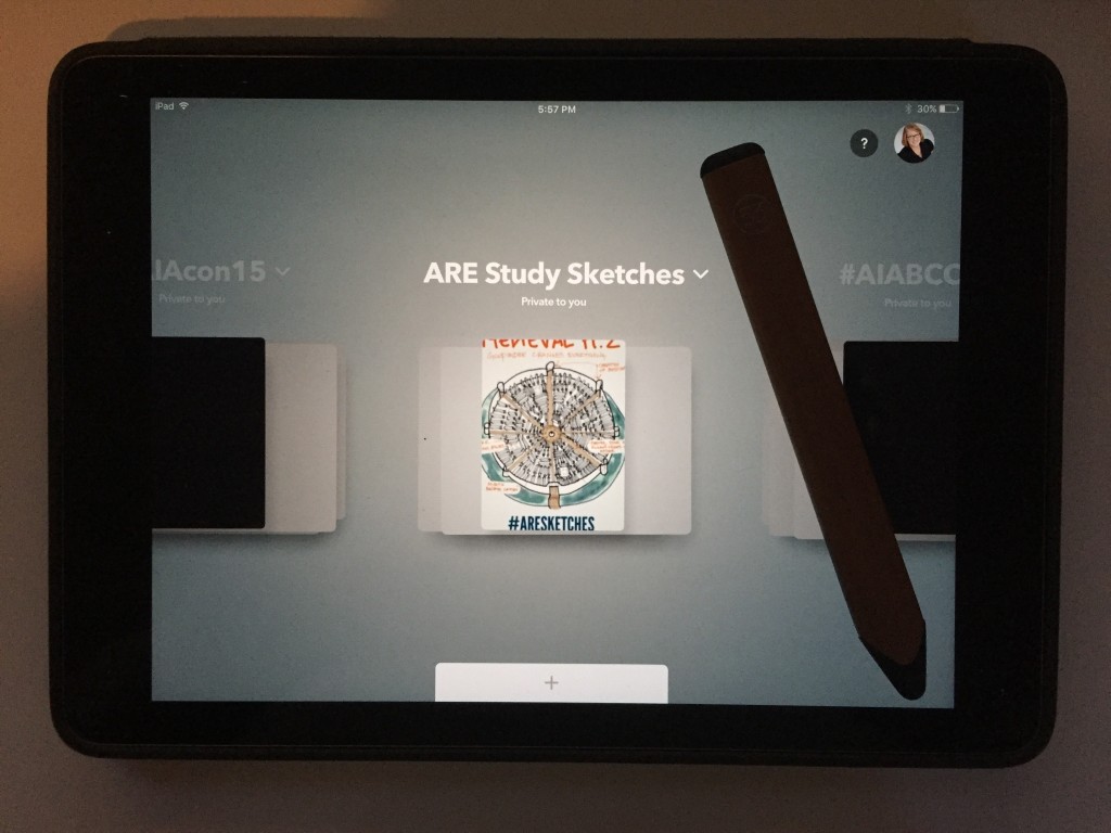
Back when I started thinking about refining the sketches, I started looking at apps to help me do so. I knew that if I wanted to share them with any sort of regularity, it wouldn’t be time-effective to hand sketch and scan (or take a picture) of each sketch. So around this time last year, I found myself downloading 5 or 6 different sketching apps and testing them out. For ease of use and output quality, FiftyThree’s Paper app won. I’ve since also purchased their Pencil, which I cannot praise highly enough (no sponsorship required). The tactile sense of the wood, the throwback to the carpenter’s pencil, it’s all done so gorgeously. The motor muscle memory of flipping it over to erase and using your finger to smudge…they’re not trying to replace analog drawing, just enhance it. Let me show you what I mean:
Do the tools fit your needs?
In the process of creating the #AREsketches, the idea of what they would look like and the level of detail they may or may not provide has been this amoebic thing very hard to nail down. In reality, the look and level of detail are always changing and adapting based on the sketch subject material. The simple goal is to show in visual form ONE piece of information; ONE little learning nugget per sketch. The tools I’ve chosen allow me to make the sketches as simple or as detailed as I like. When I first started sketching out the #AREsketches, there were times when a sketch took upwards of 20 minutes. This was more me learning and dialing in on what I wanted the sketches to look like than any hindrance of the tool itself. I now make each sketch in 5 to 10 minutes, including processing and brainstorming the information that needs to be shown. The important piece is that the tool is simply an extension of all of those other pieces that help me create the sketches.
The Tool Evolution
I just hit my 200th published #AREsketches drawing the other day, but it wasn’t always such a streamlined process. This idea and its growth were more Wright Brothers than Ford in testing and process styles: use the brains I’ve got, the tools around me, and adapt on the fly. When I started the sketches, I was sharing maybe, MAYBE two sketches a week. Part of it was the massive fear that is impostor syndrome, and part of it was learning how best to use the tools for my purpose. As my sketch output grew from 2x/week to 6x/week, the concept of turning it into a visual study book (or 6) entered the picture, and the newsletter followed shortly thereafter. I had to start planning ahead for how to meet certain goals and keep on track with creating the #AREsketches. The great thing about the tools I use is that they grew with me.
The Tools Takeway
That’s the thing about a tool. It’s only as useful as the imagination and capability of its user. The tool is not the end goal, the idea turned reality is. But you can bet that a bad tool will delay or prevent you from turning that idea into a reality. It just so happened that the tools I picked were able to keep up with my idea’s growth. And for me that’s the best kind of tool there is: the one that gets it done.
Go do great things.
To see the take on “Tools” from other Architects, follow the links to the others in the #ArchiTalks group who are posting today on the theme: Bob Borson – Life of an Architect (@bobborson) “The Tools of an Architect” Marica McKeel – Studio MM (@ArchitectMM) “3 Tools to Get Our Clients Engaged and Involved” Jeff Echols – Architect of the Internet (@Jeff_Echols) “The Best Tool In Your Toolbox” Lee Calisti – Lee CALISTI architecture+design (@leecalisti) “tool” Jes Stafford – Modus Operandi Design (@modarchitect) “One Essential Tool” Michele Grace Hottel – Architect (@mghottel) “#ArchiTalks 17 “Tool”” Meghana Joshi – IRA Consultants, LLC (@MeghanaIRA) “Tools of an Architect #Architalks 17″ Amy Kalar – ArchiMom (@AmyKalar) “ArchiTalks #17: Three Tools for Change” Rosa Sheng – Equity by Design (@EquityxDesign) “10 Power Tools to Kickstart Equitable Practice” Brian Paletz – The Emerging Architect (@bpaletz) “Can we talk?” Eric Wittman – intern[life] (@rico_w) “it’s ok, i have a [pen]” Emily Grandstaff-Rice – (@egrfaia) “Tools for Learning” Eric T Faulkner – Rock Talk (@wishingrockhome) “Architools – Mind Over Matter” Jarod Hall – di’velept (@divelept) “Something Old and Something New” Anthony Richardson – That Architecture Student (@anth_rich) “Tools I Use in Studio” Greg Croft – Sage Leaf Group (@croft_gregory) “Tools…” Jeffrey A Pelletier – Board & Vellum (@boardandvellum) “Helpful tools found within an Architecture blog” Aaron Bowman – Product & Process (@PP_Podcast) “Sharpen Your Tools” Kyu Young Kim – Palo Alto Design Studio (@sokokyu) “Super Tool” Jared W. Smith – Architect OWL (@ArchitectOWL) “Construction: An Architect’s Learning Tool” Brinn Miracle – Architangent (@simplybrinn) “Synergy: The Value of Architects” Jeremiah Russell – ROGUE Architecture (@rogue_architect) “tools #architalks” Keith Palma – Architect’s Trace (@cogitatedesign) “(CTRL A) (Command-A)- Edit” Michael LaValley – Evolving Architect (@archivalley) “Why An Architect’s Voice Is Their Most Important Tool”