Oh, you crafty!
Note: This is the seventh post in a group series called #ArchiTalks in which Bob Borson of Life of an Architect gives a group of us architects a theme or a set of questions and we all have to post our response… this month’s theme: crafty.
Outside of the Beastie Boys song, for some reason I keep thinking of the silly phrase “oh, you fancy” when I immediately think of this month’s prompt word from Bob. Which in turn sarcastically makes me think of the phenomenon of Pinterest Fails. If you’re not familiar with this concept, it’s where people have been humbly sharing their attempt at DIY crafts with the caption “nailed it”. As Mark spoke of the “HGTV Affect” last month, this is a similar “Martha effect” – where the crafts are made to look “easy to DIY.” And non-creatives quickly realize how truly misleading the internet can be.
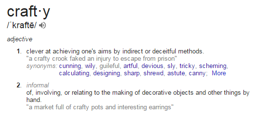
As I considered what “crafty” meant to me outside of the sarcasm, I realized that – while a bit sassy – it actually fits my view of architecture: an unexpected design detail, typically in a creative or efficient use of function, form, or material. I decided to Google the definition to see if my architect brain makes the term different than the standard accepted meaning. I actually wasn’t that far off.
I don’t think it’s any misuse of the phrase when you see a creative person at work and say they’re “practicing their craft.” From this, I could talk about the things I make, or the things made by other architect friends, both well-under the scope of “crafty”, but I decided to focus on the bigger picture. The inspiration of the word embodied in the architecture I see. “Crafty” implemented in architecture from the macro to micro.
Big = Whole Building
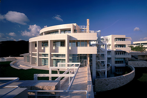
Setting aside what could be an entirely different discussion about ego, the macro example I’m going to use is the Getty Center. Designed by Richard Meier and opened in 1997, the Getty Center sits carved into the California hillside, its white metal panel and stone glimmering in the afternoon sun. The stone, 1.2 million square feet of travertine to be exact, is what I want to focus on. The background I learned in college was that when they brought Meier on board, the “powers that be” knew of his propensity for all-white, modern buildings, typically via metal panel. They did not prohibit this material, but said that it should not be the majority, requesting stone instead. This presumably had the added motive of preventing an all-white building. He acquiesced to their restriction, but proceeded to find a travertine from just outside of Rome, going so far as to prototype a guillotine-like machine to give it the aesthetic he wanted from the cut. This travertine would whiten over time, thus following their stone restrictions, but still creating what he wanted and was known for = an all-white building. That’s crafty.
What’s in a room?
This topic could also be a separate conversation about the value of space and quality vs quantity. Lately there has been a push from the “maker” side of the industry, with help from 3D printers and momentous leaps in prefabrication technology, to see what all you could pack into a space. Mayor Bloomberg even held a competition in New York City, calling on architects to help create micro apartments that would help make NYC more affordable. We’ve been designing like this for boats forever, why not an apartment? Something similar has already been done in Paris. Let’s face it, Europe does small spaces better than we do (so far). A couch that’s also a dining table that’s also a bed? That’s crafty.
That thing does what?
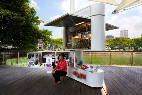
For some reason, I kept coming back to the Swiss Army Knife. Sure, there are other pieces since then which have beautiful lines inherent to their functionality, but the Swiss Army Knife started it all. The aesthetic of the size fitting in the hand, the multi-function of all of its…well…multiple functions. And then I came across this gem.
Swiss Army Architecture? That’s crafty. And I’m pretty sure there’s a kiosk competition underway for the Chicago Biennial. Hopefully someone saw this.
What do you think? What does crafty mean to you?
Until next time,
To see the take on “crafty” from other Architects, follow the links to the others in the #ArchiTalks group who are posting today on the theme: Bob Borson – Life of an Architect (@bobborson) “Architects are Crafty“ Jeff Echols – Architect of the Internet (@jeff_echols) “Master Your Craft – A Tale of Architecture and Beer“ Mark R. LePage – Entrepreneur Architect (@EntreArchitect) “How to Craft an Effective Blog Post in 90 Minutes or Less“ Marica McKeel – Studio MM (@ArchitectMM) “Why I Love My Craft: Residential Architecture“ Lee Calisti – Lee CALISTI architecture+design (@leecalisti) “panel craft“ Matthew Stanfield – FIELD 9 Architecture (@FIELD9arch) “On the Craft of Drafting: A Lament“ Michele Grace Hottel – Architect (@mghottel) “krafte“ Meghana Joshi – IRA Consultants, LLC (@MeghanaIRA) “Crafty-in Architecture as a Craft“ Rosa Sheng – Equity by Design (@Missing32Percent) “Which Craft?“ Stephen Ramos – BUILDINGS ARE COOL (@sramos_BAC) “Ghost Lab“ Brian Paletz – The Emerging Architect (@bpaletz) “Underhanded Evil Schemes“ Jonathan Brown – Proto-Architecture (@mondo_tiki_man) “Crafty“ Eric Wittman – intern[life] (@rico_w) “arts and [crafty]“
